Color can play an important role in the way people perceive your brand, products, and services. While color preference can be a personal preference, we also know that certain colors and color palettes evoke emotional responses that can influence behavior.
The relationship between brand and color is more about appropriateness than anything else. Does the color fit the brand in the minds of the buyer? When there is a fit, purchase intent is increased.
The challenge is determining exactly what fits with the brand when consumers have their own personal preferences. To that, we can look to patterns. Since studies show that we tend to prefer recognizable brands, it can be tempting to just mirror what other established brands have done. That can help with the “fit,” but hurt with brand differentiation.
What’s most important is that the colors you choose support the personality you want to show consumers.
Keep in mind that when we’re talking colors, what we are really talking about is color coordination. You need to use the range of colors in your palette to distinguish your website or app to attract attention and highlight key areas.
With the psychology of color as a backdrop, let’s look at two specific categories: technology and energy in the B2B space.
Color Palette for Technology Companies
Examining the major companies, you will find some consistency in the color palette for technology. Tech companies are looking for a way to instantly established credibility and authority, so they tend to most often choose one of four colors:
- Blue
- White
- Black
- Red
Blue, is by far, the dominant color in tech. Blue evokes stability, trust, and security. Those are certainly some of the attributes you look for in a tech company.
Color Palette for Energy Companies & Solar Companies
The color palette for energy companies also tends to skew toward blue and red. Red evokes emotions of excitement and, well, energy. Newer brands in the energy sector are embracing yellows and green.
Yellow evokes images of the sun and warmth. Green is considering a calming color and is closely tied to the idea of respect for the environment, nature, and energy efficiency.
Solar companies tend to use clean, crisp designs. A good example is Kinematics Manufacturing, which blends white, black, green, and blue.
The Psychology of Color
While the examples above are those most associated with industries, the psychology of colors is more a general guideline than a hard and fast rule. For every failure using the “right” colors, you can find dozens of success stories for brands that used the “wrong” colors.
Color is highly personal and can be interpreted by different people in different ways. This takes us back to fit. What’s important is that your color palette fits your style.
Understanding the Color Basics
When considering the right color palette for you, it helps to understand some basics.
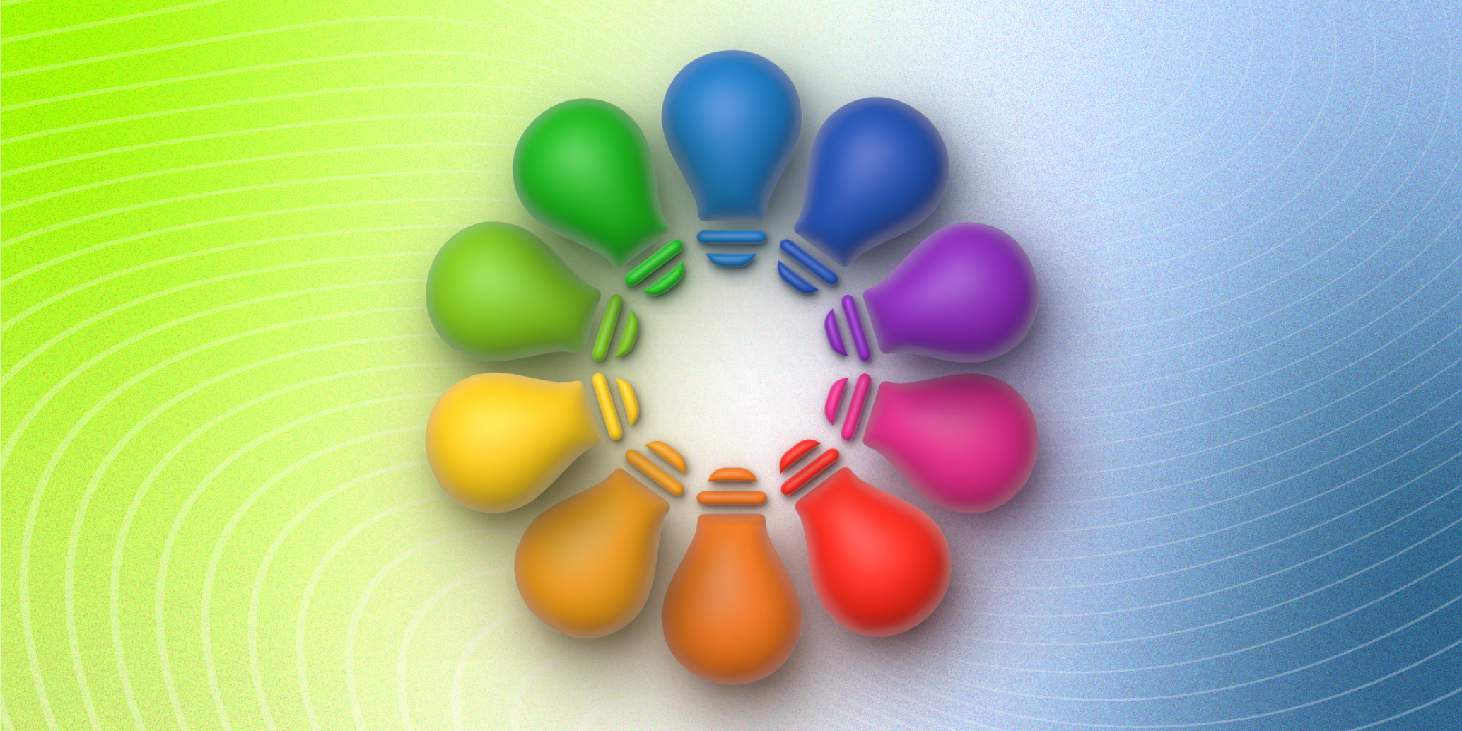
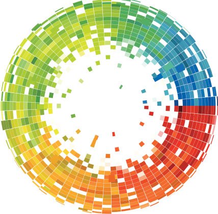
The Color Wheel
The color wheel has stood the test of time. First invented in 1666 by Isaac Newton who mapped the color spectrum into a circle, the color circle helps designers understand the relationship between colors to create pleasing combinations.
The RGB (Red, Green, Blue) color wheel is designed for online use.
- Primary colors: Red, Green, Blue
- Secondary colors: Cyan, Magenta, Yellow — colors that are created when mixing two primary colors.
- Tertiary color: Orange, shares of green, violet, etc. — colors made by combining secondary colors with primary colors
Developing a Color Palette
When creating a color palette, there are also some design basics to understand, including complementary colors, monochromatic colors, analogous colors, triadic colors, and tetradic colors.
Complementary Colors
Complementary colors are on the opposite side of the color wheel. They provide high contrast, which helps them appear brighter and more prominent.
Monochromatic Colors
With monochromatic colors, you’re using shades and tones from a single base color. It can create a harmonious look.
Analogous Colors
Analogous colors pick three colors that are adjacent on the color wheel. Typically, designers will choose one dominant color and use analogous colors as accents.
Triadic Colors
Triadic colors refer to the process of choosing three colors that are evenly spaced on the color wheel. This method produces a high contrast color scheme and creates bold and vibrant palettes.
Tetradic Colors
This method uses four evenly spaced colors on the color wheel. This can also produce a bold palette, but can also become overwhelming unless you use one dominant color and the rest as accent colors.
Color Temperatures
There are three basic color temperatures to consider: warm, cool, and neutral.
Warm Colors
Warm colors include red, yellow, and orange. They are typically associated with enthusiasm, vitality, and approachability.
Cool Colors
Cool colors include blue, green, and purple. They are most often associated with professionalism.
Neutral Colors
Neutral colors include white, black, gray, or brown. They symbolize sophistication or elegance.
How to Choose the Right Colors for Your Tech or Energy Company
There is more science and strategy behind choosing the right colors than you probably thought.
While there are standard colors, color combinations are virtually unlimited, especially when you think about adding in hue, tone, shade, and saturation.
While the color wheel is easy to understand, it takes an experienced designer to use the color wheel to create an optimal effect.
Which color palette is right for your tech or energy company? Let’s Talk.